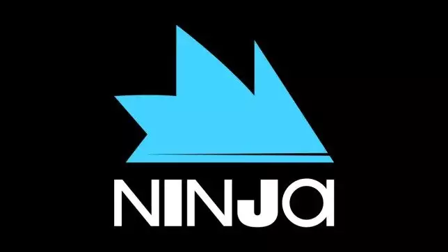
Popular Twitch Streamer and former Pro Player Richard Tyler Blevins, popularly known as Ninja has just announced a rebrand of his logo and name, and it was as well received as you would expect.
Ninja is one of the biggest streamers on twitch and has been growing massively since 2017. In march 2018, Ninja became the first streamer to surpass 3 million followers on Twitch and set the record for the most concurrent viewers on an individual’s stream, at the time, with 635,000 concurrent viewers. He was also the first one to get a skin in Epic Games’ Battle Royale, Fortnite.
After becoming hugely popular, Ninja decided to undergo a rebrand. From the previous yellow and blue theme which he was associated with. In the rebranded logo, NINJA is presented with the I and J in bold, while the font used makes it look like it has a hidden meaning too.
In recent times, multiple teams have decided to rebrand their logos, most notably – Ninjas in Pyjamas, Mouseports (now MOUZ), Hellraisers etc.
These rebrands are almost never well received and fans prefer the older ones by a margin.
The same was the case with the Ninjas rebrand. Esports journalist, Jake Lucky took no prisoners and mentioned straightaway in a tweet how the rebrand made it look like ‘NINJOI’.
Popular esports organisation, Sentinels didnt hold back either and trolled Ninja for his rebrand. They posted their own ‘Rebrand’ with different letters emboldened to take a dig at Ninja.
It is safe to say, the community prefers the old logo for now and the rebrand hasn’t gone down well with them. But with time, maybe the new Ninja logo will grow on them too.


